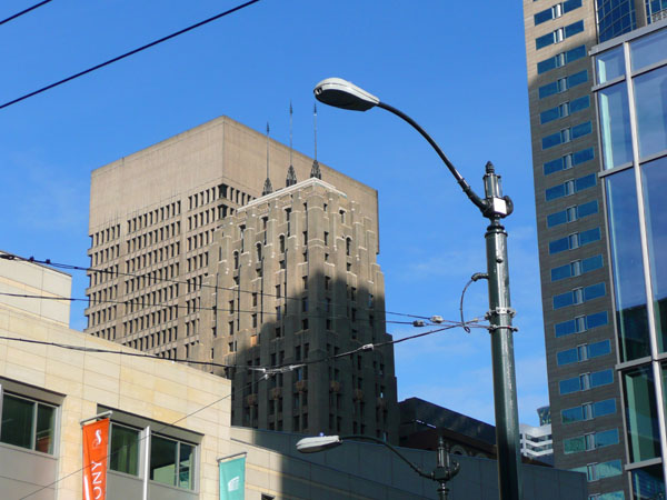
Windowless Concrete Penthouse

What is up with that ~30 feet of blank concrete wall at the top of the Financial Center Building at 4th and Seneca? That’s a good three stories of wasted building height way up there where the views are best. Ten feet above roof level to screen rooftop mechanical equipment would not be unusual. So then what about that other 20 feet? A secret CIA detention center perhaps?
Even though it’s almost exactly the same color, Seattle Tower, built in 1929, provides a good contrast. As you would expect, the top floor window head height is roughly one story below the top of the facade. But of course, the much more glaring contrast is in the richness of design (yup, I’m stating the obvious again). The complex art-deco facade is immediately impressive, but there is also an easily missed subtle detail: the shade of brick gradually lightens moving up the building to mimic the play of light on mountains. And the cavernous lobby reinforces the metaphor, suggesting an alpine cave. (Is the Four Seasons building at 1st and Union a modern example of a similar architectural nod to nature?)
Some probably feel that Seattle Tower’s art-deco style is overwrought and has not held up well over time. But if nothing else, the building’s design reflects a passionate belief in something, whereas buildings like the Financial Center speak of a culture driven solely by dry utilitarianism.
In the present era, our culture has no unifying sense of beauty or pattern or pride that manifests itself to any substantial degree in our buildings. But there is some hope: ecologically sensitive design has great potential to bring some deeper meaning back into architecture. The Seattle Justice Center and the Ballard Library are two good local examples of compelling built form that embodies cultural values rooted in sustainability.
