Design Standards Ordinance FAIL
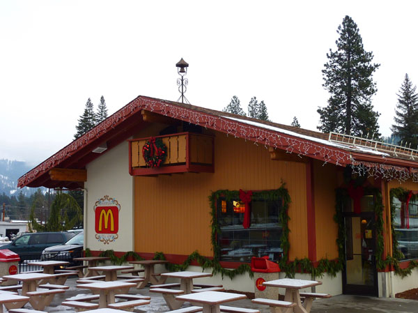
Take a minute to admire the adorable tacked-on faux balcony in the photo above. And now thank the genius code writers of Leavenworth, WA. Cause apparently, if you want to put up a commercial building more than one story tall in Leavenworth, a nordic-style balcony it must have. Not that it has to be usable.
Back in the 1960s when Leavenworth was in decline, the town opted for Extreme Makeover: Mock Bavarian Village Edition. The historic brick downtown was stuccoed, balconied, and gabled. And amazingly, it succeeded brilliantly. The blatant cheesiness of fake balconies and such only seem to add to the kitschy charm of the place.
Another striking result of the Leavenworth design standards is a gaping lack of the gigantic, brightly colored, in-your-face corporate signage that dominates the look of most U.S. downtowns. That “M” is all that the global superpower of fast food could get. There’s a Bank of America, but without the usual array of glowing red and blue signs yelling at you. The reduction of visual pollution is palpable.
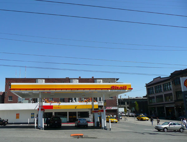
Now admire the screaming yellows, reds, and whites of the Shell station located in the heart of the Pike/Pike Conservation Overlay District in Seattle (photo below). This gas station is by far the most out of character structure in the entire district. And it’s no accident—those painful colors are specifically chosen to grab the eyeballs of the rapidly passing motorist.
Note also that the gas station use is completely inappropriate for one of Seattle’s most pedestrian-oriented neighborhood centers—all the more so because it’s located on the corner of a prominent intersection. It would be great to see some of the neighborhood activists’ take on that Shell station as public enemy number one.
As ridiculous as Leavenworth may be, perhaps Seattle could learn something from how they successfully implemented design standards that trump the entrenched habits of corporate America. Why do we put up with loathsome scars like that Shell station?