
Which Slice To Eat First?
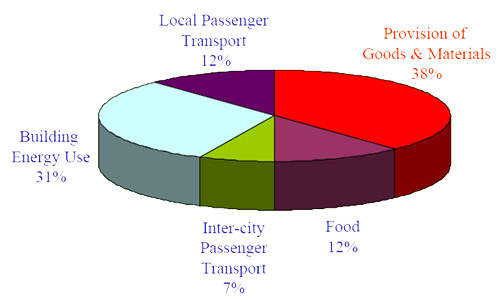
[ Source: Oregon Department of Environmental Quality and EPA ]
Via Sightline, the 2005 U.S. greenhouse gas (GHG) emissions chart above illustrates an alternative way cut the pie, emphasizing the importance of goods and materials, and suggesting we ought to look at ways to use less stuff. But to intelligently assign priorities, it’s also helpful to know how challenging and costly it would be to make a given GHG source reduction. Behold the most excellent diagram below, via Worldchanging:
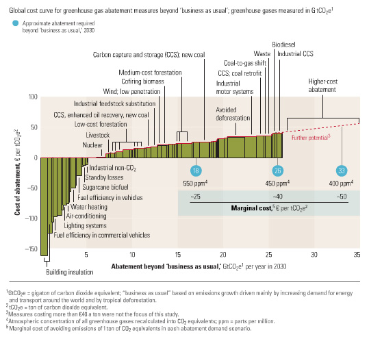
[ Source: The McKinsey Quarterly ]
The bars going negative indicate that the GHG emissions abatement measure actually saves money overall — free lunches, so to speak, i.e. no-brainers, one would think.
Note that four of the five most cost-effective measures address energy use in buildings. And now take another look at the chart at the top of the post and mark the second biggest slice of pie. And while your at it, ponder this analysis that attributes an even higher portion of GHG emissions to buildings. Translation: buildings are low-hanging fruit and there’s a lot of that fruit, and thus should be a focus for cutting GHG emissions.
(Also note: Increased fuel efficiency in commercial vehicles could potentially help put a dent in the emissions related to the provision of goods and services.)